2. Device Diversity
Web developers have been
spoiled for years. For almost a decade, most computer users have been
surfing the Web using Microsoft's Internet Explorer browser, most
probably running on a Windows operating system. Although this browser
has been hardly perfect throughout that time particularly in terms of
rigorous standards support (and indeed "spoiled" might feel like the
wrong adjective!), the prevalence of a single predominant browser had
one distinct advantage. Yes, web developers have to work hard to deal
with the quirks and strange behaviors of this particular piece of
software, but at least they only had to do it once.
Over the last several years,
other web browsers have begun to make serious inroads into Internet
Explorer's market share. Browsers like Mozilla Firefox, Google Chrome,
and Apple's Safari have rapidly increased the likelihood of a given user
visiting your site with a non-Microsoft browser. On the whole, these
browsers are highly standards-compliant (and Internet Explorer has also
improved in this respect), so although there has been an increase in an
average developer or tester's workload, this has been incremental,
rather than intolerable. Yes, there is an increased diversity in browser
usage, but you can still be fairly confident that most of a
well-written, standards-compliant web application will function and
display more or less equivalently across a range of contemporary
browsers.
The situation for mobile
web though, as you might have guessed, is a completely different story.
There is far more variation in device and implementation of web browsers
than you will ever have seen on a desktop or laptop environment, and
you quickly discover that diversity — of both a device's physical
characteristics and the software that runs on it — is a particularly
painful fact of mobile web development life. This has an understandably
large impact on the approaches you should take to prepare for, develop,
and test the quality of your mobile web applications and services.
You've already seen a range of
physical form factors for mobile devices. The most immediate aspect of
diversity that strikes a newcomer is the dimensions of the screen. It's
certainly true that this alone has one of the biggest impacts on how you
design your mobile web applications — particularly if you have
expectations of being able to implement "pixel-perfect" designs as you
can on a traditional web browser.
Take screen width, for example. The chart in Figure 7
(taken from DeviceAtlas, a comprehensive online database of mobile
device characteristics) illustrates the degree to which mobile device
screens vary. It plots the number of distinct device models that have
various physical screen widths in pixels, on a non-linear X-axis.
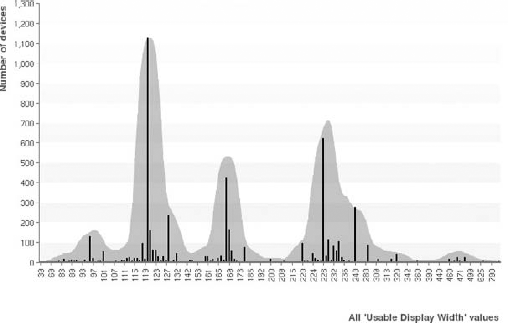
The first thing to notice is
the sheer size of the range in screen widths. While you may not feel it
necessary to build a site that caters simultaneously for outlier devices
with screen widths of 39px and
of 790px, the majority of device models still have widths lying between
about 100px and 300px — a significant range to adapt your site to.
It's also worth noting that
the distribution of screen widths is "bunched" into three main ranges,
spanning widths of approximately 100px-140px, 160px-190px, and
220px-320px. You may correctly deduce that these are low-end (or older)
devices, mid-range devices, and high-end devices respectively, and
certainly newly released devices are also more prevalent at the right
end of the chart.
Nevertheless, this is a far cry
from a desktop or laptop browser world where screens fall into a small
number of distinct sizes and where a single constant page width (say,
960px) would be an acceptable structure for display on most screens.
Apart from the screen and
keyboard, other physical characteristics of devices that may affect
mobile web design include their ability to be tilted or rotated, whether
they accept touch-screen gestures, whether they can emit audio or
vibrate, whether they can take images with one or more cameras, and even
whether they can detect their own location through cell triangulation
or GPS — all underpinned by the browser's ability to actually allow
client-side web services to access those physical capabilities.
While physical differences
among devices are perhaps the most obvious, you need to take into
account many more considerations that relate to their software
characteristics. Because the operating system of the device underpins
the majority of a user's experience with it, this itself is an important
factor. There is nothing yet approaching the dominance across mobile
devices of a few operating systems (as seen on desktops and laptops,
with Microsoft Windows, Apple's OS X, and various Linux systems, for
example). While the race is on to create the mobile world's dominant
operating system — particularly among the high-end sector of the device
market — the field is still remarkably open and varied.
But most importantly to the
mobile web developer, it is the devices' web browsers themselves that
are the most significant source of diversity, and this is an area that
you need to understand better than any other.
3. Browser Characteristics
Less than 5 years ago, when
most mobile devices used their own embedded or simple real-time
operating systems, it appeared to mobile web developers as though there
were as many operating system versions as there were models of devices.
Given that these operating systems tended to contain their own varied
browser implementations, with no option for users to upgrade them or
install alternatives, the challenge of delivering a reliable web
experience to all of them was almost insurmountable. Such browsers were
typically very limited, and often derived from their WAP browser
precedents, provided limited or incomplete XHTML or CSS capabilities,
low-fidelity media support, and little or no opportunity to use
JavaScript or AJAX in web pages.
In 2005, Opera, a
Norwegian browser manufacturer, launched Opera Mini, a browser that
could be installed by the user on such devices and which subsequently
has become a very popular third-party browser for older and low- to
mid-range handsets. (Opera also provides a more capable browser, Opera
Mobile, which runs on high-end devices, primarily those running Symbian
and Android.) Using a proxy architecture to compress, adapt, and
re-layout the content on behalf of the device, this browser provided the
first glimpse that rich and complex websites could be rendered well and
made relatively usable on a typical mobile device screen. Figure 8 shows Opera Mini v3 rendering a complex blog site in a way suitable for a simple mobile device. Figure 9 shows the same site rendered in Opera Mobile.


At about the same time,
Nokia released a new browser for their high-end S60 range of devices
that was based on code from the open-source WebKit browser project.
Given its desktop heritage, the WebKit engine provided an unprecedented
level of support for HTML, CSS, and JavaScript on a mobile device. This
was something of a watershed in the history of mobile browsers, and
since then, a number of significant mobile device platforms now ship
with WebKit-based browsers, including Apple's iPhone, Google's Android,
Palm's WebOS, and most recently Blackberry. Microsoft's mobile operating
systems do not provide WebKit-based browsers, but the capabilities of
their default browsers have risen significantly in recent releases.
Figure 10
shows the same blog site as above rendered by WebKit-based Safari
browser on the Apple iPhone. Such browsers have rendering capabilities
on par with some of their best desktop brethren.
While the different
implementations of each of these browsers can vary radically — device
diversity is not going away any time soon — they do at least share a
common open-source ancestry. This has helped the cause of efficient
mobile web development greatly, because a developer or designer can at
least assume a reasonable level of support for image and media support,
CSS, and AJAX (although not Flash, video, or vector graphics, which
remain variable in their support across browsers).

Unfortunately, it's easy to
forget that not all users are necessarily running the latest and
greatest smart phones. Many cheaper handsets still run on embedded
operating systems with weak web or WAP browsers, and in certain parts of
the world, or for certain demographics, these still can be extremely
prevalent. Unless you are absolutely sure that all your target users are
going to have a small number of models of WebKit-enabled smart phones,
you need to be defensive about how you use more advanced web techniques.
4. Speed and Power
A mobile device
manufacturer has to walk a fine line when designing their models. The
target size and weight of a device are more or less constrained by
market expectations — no discerning customer would buy a 2-pound mobile
device to put in his pocket — and yet there are ever-increasing demands
placed upon devices by modern radio networks, brighter screens, more
powerful cameras, and more complex browsers and applications.
There is, therefore,
a balancing act maintained between a device's battery weight and life,
its CPU's speed and power requirements, the number of applications that
can be run simultaneously, and the screen specifications, among other
factors. The means by which a device's manufacturer achieves this
balance often has implications for the mobile developer. Apple's iPhone,
for example, when first launched in 2007, had a fantastic screen and
browser for its time, but supported only the dated GPRS and EDGE mobile
data technologies and provided only a single-threaded process model.
This meant that web access was slower than on rival devices, sites
needed to heavily optimize their content, and users could not run
application and browser sessions concurrently. Subsequent models did add
faster 3G networking, but it was many years before the device finally
offered multi-tasking of applications.
On most devices, battery
technology and the heat emission caused by powerful CPUs remain the
ultimate constraints upon the capabilities of the device. A desktop or
laptop computer using AC power or a large battery can contain
power-hungry CPUs and dissipate their heat with spacious, effective
cooling systems. A web developer hardly takes these physical
characteristics into account, because even a highly graphics- or
script-heavy website barely affects the machine's performance.
A typical mobile device,
however, has a CPU clock speed of much less than a tenth of a typical
desktop computer. Much of the battery power is being used simply to keep
the device actively connected to a cellular or WiFi network. And a user
does not want to get sweaty hands holding a device that is struggling
to dissipate the heat generated by heavy application or browser usage.
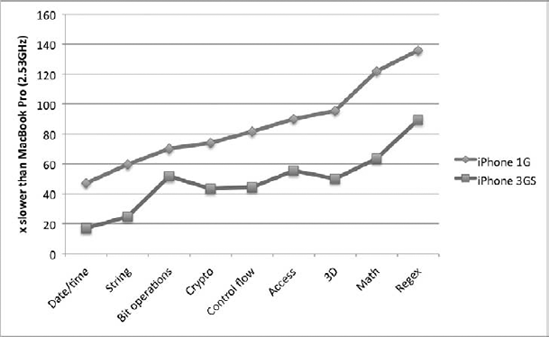
To illustrate just how constrained even a contemporary device is, Figure 11
shows relative results of the SunSpider JavaScript benchmarking test
suite run on the Safari browser on two different iPhone models. The
figures given on the y-axis are the factor slower
that these devices run relative to Safari 4.0 on a contemporary MacBook
Pro laptop. For instance, the regular expression portion of the test
took almost 90 times longer (1.7s) on the iPhone 3GS than on the laptop
(19ms), and even basic string and date/time manipulation is 20 times
slower. This is a dramatic difference indeed.
Benchmarks aside, what
these constraints mean for a web developer is harder to judge
quantitatively. In broad terms, it is obviously sensible to keep the
amount of unnecessary or complex client-side processing to a minimum. A
computationally expensive animation or video on your website that can't
maintain your intended frame rate (and which drains the device's battery
life) obviously will not be popular with your users. Large, tag-soup
pages will place a processing and rendering load on a device that
svelte, well-formed XHTML pages will not. Clever page transitions and
graphical effects will falter on devices without accelerated hardware
APIs to support them.
Some mobile developers take
the approach that a site should cater to the "lowest common
denominator" and simply avoid using features that might be challenging
for most mobile devices. Unfortunately, users (especially those who have
invested in high-end devices) have high expectations, and you should
aim to use such facilities when they are feasible. Ultimately, the best
understanding of that feasibility, and your practical limitations,
comes through testing and examining your sites' performance and impact
on real handsets.